When I first discovered local satire site New Nation several years ago, I thoroughly enjoyed their brand of humour. It paved the way for an alternative style to discussing hard news.
A couple of visits later, my eyes were begging for mercy.
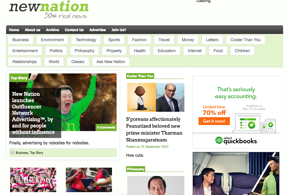
As much as its content was refreshing, the site was just rather ugly. The design was an offbeat combination of lime green and white, with a font that resembled Tahoma, one of the most amateur looking fonts I know.
In addition, the layout looked like it was hastily selected from the most basic WordPress templates. There were a few ad banners by the side, a Facebook widget that appeared out of place, and a peculiar distribution of whitespace.
Sure, New Nation’s content was rich in quality, but you’d be forgiven for thinking the site only targeted people with poor taste.
While I admit that content is the main draw to a site or brand’s Facebook page, design is the dealbreaker that determines whether I return. (To be clear, design here strictly refers to visual appeal, not user experience.)
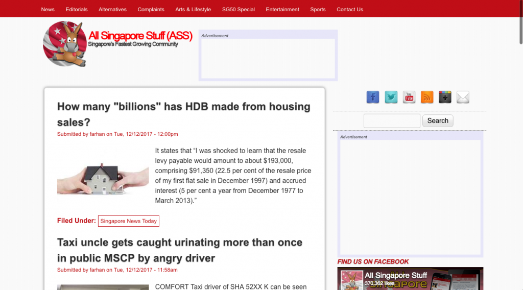
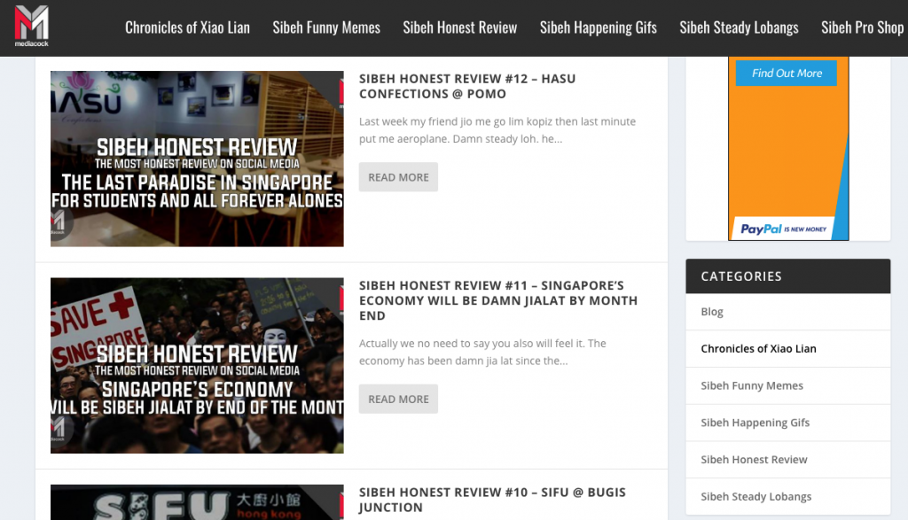
Coincidentally, the more visually unappealing websites I’ve noted usually fall under “alternative” sites, such as All Singapore Stuff, States Times Review, and Mediacock Singapore. A couple of these sites share the same sentiment: content is key, design is secondary.
“We design it with basic function in mind. No special effects or fancy idea at that time. Content will make people read our website, more than nice design,” says the All Singapore Stuff editorial team.
I suppose that is why they are able to get away with a logo whose text is squeezed together. There’s also a strange drop-shadow effect on their article headlines, which aren’t consistent to begin with. Some are written in all capital letters, others like a normal sentence, and a few capitalise the first letter of every word.
All in all, the design is a hot mess.
They too believe content is more important than design. In fact, alternative sites like themselves don’t seem to prioritise design because they lack the resources, both in manpower and money.
They’re also honest about what drives readers to their Facebook page and website.
“We don’t purposely design our collaterals to look slipshod, but we think the masses can connect with its more ‘raw’ and ‘street level’ feel. That said, if the content isn’t good, no amount of design will matter.”
Mediacock admits that not being too fussed with design has its drawbacks. For instance, they haven’t ventured into Instagram because “that platform’s very visually driven”. Facebook, where their main traffic comes from, is where “people look for information”.
As such, they believe the design of collaterals also depends on how people are using that particular platform.
So context and content drive design. After all, if a brand only attracts a certain type of reader on a particular platform, maybe it’s time to look at what that reader finds visually appealing in order to keep them around.
Both All Singapore Stuff and Mediacock do not have statistics of their audience demographic. But you only need to look at the Facebook comments they receive to conclude that a significant part of their readers are the angry anti-establishment folk.
Perhaps good design works against you if you want to appeal to this crowd. Websites with clean fonts and good user experience could look and feel too elitist to communicate the populist sentiment of these alternative sites.
If you want to capture the attention of the anti-establishment crowd, your website needs to look ugly.
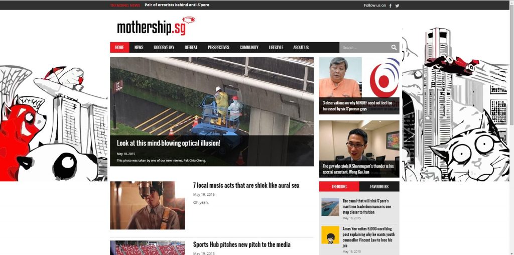
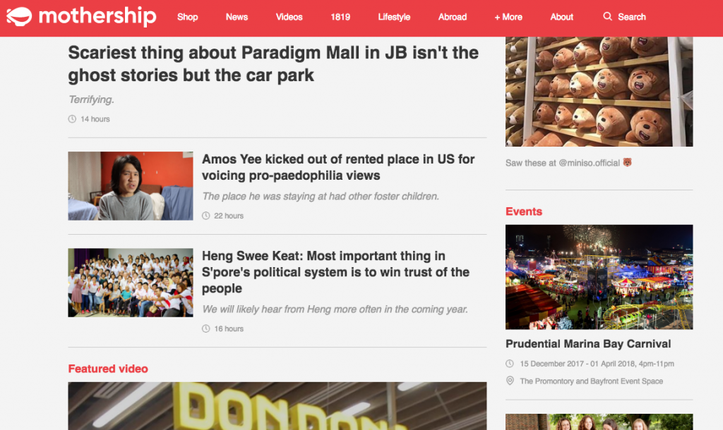
Take Mothership for example. Because of its branding and positioning, you don’t even have to read their content to form the impression that they’re relatively more well-respected than most other alternative sites.
A huge part of this is due to their design, which takes reference from “international news sites, such as Vox and Quartz”.
Teo Yu Sheng, who was involved in Mothership’s redesign with his brother, says, “We considered appealing to younger people, looking professional, and retaining quirks of Mothership. It’s more polished now.”
Frankly, it’s not exceptionally brilliant. But in comparison to their previous clunky layout, their current one is far simpler to use, making browsing an overall painless user experience.
There’s also the ubiquitous peach colour that grounds many of its design elements, such as the titles and top banner, quickly cementing itself as Mothership’s ‘official’ colour in readers’ minds.
Yu Sheng adds, “In the beginning, visuals probably didn’t matter that much to readers. But in recent years, the younger generation is starting to develop a discerning taste for good design. So unless scrappiness is an integral part of the brand, people generally enjoy visual upgrades and usability upgrades.”
Many I speak to suggest that Mothership simply has the budget for design. Most other alternative sites are usually poorly designed because they don’t have the money.
But I doubt the reasons for ugliness are that straightforward.
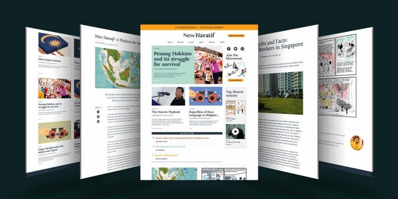
However, their skin is sleek, effortlessly balancing pictures, text, and whitespace. Fonts used boast clean lines and don’t come from the font families we’re used to. The colour palette is also muted and complementary.
And yet, to the average Singaporean, these design choices will likely appear highbrow and elitist, resulting in a niche readership.
Don’t get me wrong, readers of Mothership and New Naratif are not defined by their preferred site’s design. Still, we can’t deny these two demographics will be differently attracted to either style.
Therefore, chances are, if your interests and perspectives tend to be more mainstream, you’d prefer Mothership’s content and design.
When we dumb down content for the masses, we also inadvertently play to mainstream design tastes as well.
We learn what’s refined or tacky by the things they’re associated with. For example, sensational news sites that target the masses often use cartoonish fonts and garish graphics, while more professional and serious sites tend to use minimal colour and sleeker fonts.
I speak with a creative director, who says, “It’s not that one design language is better per se, but it’s what kinds of associations and comparisons viewers make, such as between The New Paper and Monocle magazine.”
Maybe the relationship between design and content is really that simple: the worse the content, the less thought has to be put into design. We all know that even the most flawless design can’t save a shitty product. Besides, the audience who like terrible products might not even care or understand good design, so why bother trying?
So we may be tempted to think people who subscribe to sites like All Singapore Stuff are less educated and lower class than someone who enjoys New Naratif, merely by looking at what their contrasting designs imply. The former is simplistic; the latter is simple.
Yet, if there was a measurement for ‘good’ or ‘successful’ design in Singapore, maybe it is simply whatever works for readers. Therefore ‘good’ design is elitist if it doesn’t cater to what the audience appreciates or is familiar with.
The reality is, when we dumb down content for the masses, we also inadvertently play to mainstream design tastes as well.
Unfortunately, what all this means is that opinions of designs snobs like me don’t matter. If I want to continue reading good content on ugly sites circa 2010, my eyes are just going to have to bear with the horrid colour schemes and hideous fonts.