It was always our intention to build a website that was simple, beautiful, and easy to navigate.
When RICE first launched more than a year ago, one of the first pieces of positive feedback we received mentioned exactly those things. Readers liked everything from our font to how our site interface made reading a painless experience—a fact that we found extremely encouraging.
Since then, RICE has grown in ways that none of us have expected. Our audience has grown (for which we remain grateful), we’ve started putting out more content, and we’ve also started covering more content verticals.
Along the way, we reached out to readers to find out how their experience of the website could be improved. Many mentioned that they would like us to explore more types of article formats, while others wanted it to be easier to look up older stories. Some even said that they couldn’t understand what we were about just by looking at our homepage.
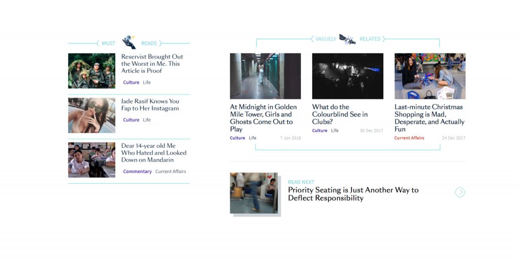
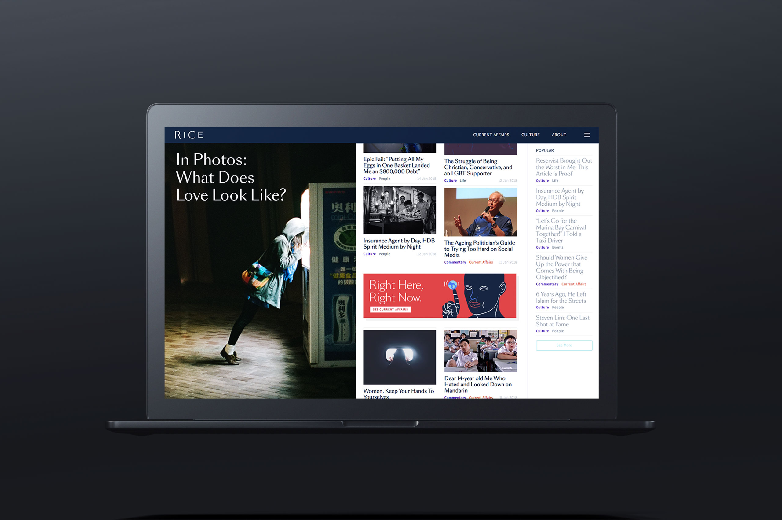
The redesign of the site is meant to address all of these things, to accommodate the increase in our content output, and to make it easier to navigate through all our different types of stories.
Hopefully, the site’s new features will help to facilitate the next step in our evolution as a brand. As our partners Somewhere Else and Convey have described, the goal of the new website is to have a “unique yet non-intimidating identity system that communicates Rice, while also sparking curiosity that would encourage readers to explore the site.”
After all, RICE might cover taboo subjects or take controversial positions on certain issues, but our aim has always been to reach a mass audience. We’re not only interested in readers who are woke or readers who love going against the grain or readers who aspire to influence culture. We also care about meme-lovers and politically apathetic Singaporeans who just want their 5 Cs, brunch selfies, and to retire by 55.
Our perspective, we believe, has room for everyone.

Many of the new website’s features are purely functional. We’ve divided our content into two main categories: Culture and Current Affairs. Within each of these categories are more specific sub-categories identifying the different types of stories that have come to define RICE’s voice, identity, and positioning.
More importantly, this new site aspires to encourage you, our readers, to visit us directly from your desktop browser.
Today, most of the content we consume gets delivered to us through Facebook. This isn’t ideal, because the Facebook feed doesn’t allow you to fully experience a publication’s perspective or philosophy. Instead, every publisher’s content simply appears in a disjointed series of random interestingness.
On top of this, reading via mobile means that many of us engage with online content in a fleeting, economical way. We skim, scroll quickly, and have barely enough time to spend digesting something before we are onto checking out something new.
It is in this landscape of media consumption that RICE has been quite lucky. We’ve noticed that many of our readers take the time to understand, dissect, and criticise what we have to say. And it is extremely important to us that this keeps happening.
As such, our new website also aims to inspire readers to consider RICE a publication worthy of carving out time for; to sit down with at the end of a long day, maybe with a beer or a glass of wine. We want you to stay and explore, and to not just read what we write but to talk about it with your friends and family.

RICE, along with our partners, has always believed that good content cannot exist without good design. Our work is as much about what it contains as it is about how we deliver it and how you experience it.
In the meantime, we’d love to find out what you guys think of our redesigned website. If you have something to say, don’t hesitate to write to us at community@ricemedia.co.
PS. We are also on Instagram. Follow us here.


